Sh!t I Learned Today: Author Branding
(Basically, how I completely screwed up my own author branding)
I see you there, cringing and grimacing and moaning because, oh !*&%, this is another post on branding. But I promise, this won’t be like that. I’m not going to tell you what to do.
I’m going to tell you how I screwed up. And how you can avoid the same mistakes.
So like everything else I do in my Sh!t I Learned Today series, this is like self-help but in reverse. Let’s get started.
Okay. So recently, I discovered something awful: I haven’t been paying attention to my book covers.
In the sense that I haven’t paid attention to making them all look cohesive, like one author wrote them. Now I write in multiple genres, so this is a bit harder. But I still could have done a better job if I had paid attention. Of course, I’ve paid a fantastic designer to create beautiful covers for me. I LOVE my covers. But when I go into brainstorming for a new cover or a new series, I don’t think about:
- How this cover will look alongside my other covers/series
- If this cover represents my author branding
- Will new readers see this book in the also boughts or recommendations on Amazon and think, “Oh, that’s a Meg Collett book.”
Obviously, I plan for all books in the series to look similar to each other. So, I would safely say that readers could identify what books of mine fit into my different series. For example:
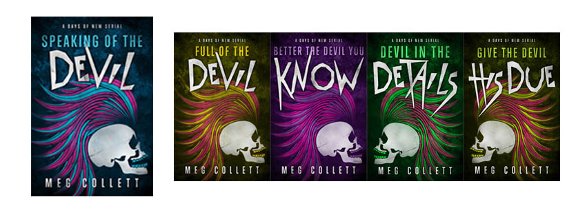
These are my Days of New covers and I even did a post on branding a serial series. This serial series is a spin-off of my End of Days trilogy. Now these covers work PERFECTLY for the books, which are a sort of gritty, dark comedy. I LOVE these covers. I want to lick them. But do they fit with my End of Days books? Would you look at these covers and say, ‘oh maybe these are similar to her End of Days books? I’ll check these out because I enjoyed those books.’?
Here are my End of Days covers:

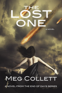

These covers were taken by the super-talented Adrienne McNellis. They are the first three covers I ever commissioned, and I LOVE how they look. I think they look cohesive and telling of what sort of story they contain.
Here’s my first tip for author branding:
What I should have done was model every future cover to look similar to these three. As in, I should have maintained similar typography and style. Future covers wouldn’t have to look exactly like these, but I could have prominently featured one character (which would have fit with my other UF and PNR-ish genre books). I could have stuck with this font because it’s awesome and simple enough to translate across almost any cover.
Maybe I could have kept those cool graphic skulls from the Days of New covers if I had used the font and style of typography from the End of Days series to show a cohesiveness across series and solidify my author brand. Also, I could have asked my designer to use a similar color scheme.
One author who CRUSHES her author branding is Shannon Mayer. Here is the link to her Amazon author page. Take a second and flip through her covers. Now, most of these are urban fantasy, but I read where she always, always uses that specially designed author name. Zoom into a cover and look closely at her author name. See the marks and style of it? She does that on purpose. And she carries it across to every cover. She keeps her name big and prominent on every book. Just that one similarity across all her covers really does a lot for her author branding, right? Even the colors and vibrancy seem similar.
Tip:
Pick a style for your author name that is simple enough to translate across any cover. So don’t go crazy here. Don’t pick something that you’ll hate in three years and want to re-do. Keep it simple and elegant. Use that style of author name on every branding material you use. Teasers. Website. Twitter and Facebook banners. Use this image across every platform you have. Force potential readers to see it a million times. But pick carefully. Pick neutrally. And THINK about what you like. What image you want people to associate with you.
For example: that font and style of my name from the End of Days series would’ve been perfect to use on my other books. Like these:

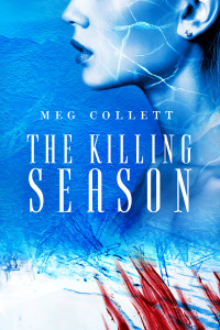
So these are my latest covers for my most recent releases. They are VERY different from my End of Days/Days of New books. This is also the point in time where I realized I had really screwed up my author branding.
Once again, I LOVE these covers. I had them done very specifically. These books re-tell the Filipino aswang legend. There’s lots of action, horror, and romance. But these books are NOT paranormal romance even though there is a very loose shifter element. But I did not want to put a sexy couple or shirtless dude on the cover because readers would think PNR. And then ultimately be disappointed. While there is steam and sexy stuff, it’s not much. Not enough to satisfy a typical PNR reader.
But these books are sort-of urban fantasy. Without the “urban” part. They’re set in Alaska, so not a big city. But UF is so much more than just a city setting. UF books focus more on the action and main character than PNR, and usually the romance takes a backseat to the main story. A big thing in UF covers is the prominently featured main character. I could have put a woman on the cover but still have kept the red/blood and blue/ice overlay with the black claw marks and red blood marks. I also could have brought in the style/typography of my name (from the End of Days books).
I think just those few changes would have created a visual continuity between three different series and solidified my author brand.
So moral of the story: If you’re a new author and you’re working on getting your first cover done, stop and THINK. You’re in this for the long haul, not just this one cover or one series. You don’t have to follow genre tropes for covers, although a lot of people will tell you that you should. You don’t need a couple doing it on your romance cover to sell.
You need a cover that you LOVE that you can use in your author branding (like how your name is done) across all platforms. You need a cover that your readers will love, and when your readership grows, you need a “look” that your readers will expect. That’s all.
But my biggest tip for your author brand is: Be careful. Think WELL in advance. Think about that new series idea rolling around in the back of your head. Will the cover STYLE of your first book fit that potential new book down the road? Can you use the same author typography if you decide to write space opera later on?
Author branding is planning. Committing to what you got. And running with it.
Don’t get a bajillion covers in, look back, and think ‘oh shit.’ Because that ‘oh shit’ is going to be expensive. And annoying. And it’s going to take time away from that next book you should be writing.
So good job, Meg. Good job.
Post image by Hoil Ryu via unsplash.com <– The BEST source for free images with free rights.